Client
Sunco Construction
Project
Website Re-Design
My role & skills
Head of Stragegy
Project lead
Information architecture
Strategy
Development lead
UX lead
Design lead
Background
Sunco Construction’s website was outdated and lacked optimization for both load times and usability, which impacted user engagement and failed to reflect the high-quality construction work Sunco wanted to showcase. My objective was to create a modern, easy-to-navigate website that emphasized Sunco’s expertise in residential and commercial construction.
Process & Workflow
Initial Research
Stakeholder Interviews: To begin, I conducted meetings with Sunco’s leadership team and several core office members to gather insights into their goals, user feedback, and ideas for the redesign. Sunco’s primary goals were to:
Simplify navigation and improve usability.
Modernize the visual aesthetic to align with the quality of their construction projects.
Highlight their diverse portfolio of commercial and residential work in an accessible, appealing way.
Through these discussions, I learned that users had previously struggled with the site’s navigation and clarity around service offerings. Sunco’s team also highlighted the need for efficient contact methods and flexibility in showcasing projects.
Customer Feedback Analysis: In addition to internal interviews, I reviewed feedback from Sunco’s customers. Key takeaways included:
Navigation Issues: Users reported difficulty in locating company information and services.
Portfolio Requests: Customers wanted to see more project details, especially for larger commercial projects.
Contact Accessibility: Clients needed an easier way to find contact options, with clear paths for specific inquiries.
Card Sorting Exercise: Based on stakeholder insights and customer feedback, I conducted a card sorting exercise with Sunco’s team to explore potential website structures and refine the site’s navigation. This exercise allowed team members to participate in categorizing content in a way that made sense from both user and business perspectives.
Information Architecture
After finalizing the card sorting exercise, I mapped the website architecture in a FigJam file, creating a detailed structure of primary, secondary, and tertiary pages for review. This layout helped Sunco’s team visualize the flow and hierarchy of information on the website. We ultimately arrived at a streamlined architecture that organized content into four primary tabs:
About: Consolidating all company history, team, and core information under one tab made it easy for users to access company background without navigating across multiple pages.
Services: We divided this section into two main categories—Commercial and Residential—reflecting Sunco’s key service areas. This organization helped clarify the scope of their offerings.
Portfolio: A dedicated Portfolio tab allowed Sunco to prominently feature completed projects, giving prospective clients an immediate view of their work quality and diversity.
Contact: This tab included various contact forms and methods, segmented by user need (e.g., service inquiries, project consultations, general contact), providing a clear path for users to reach the appropriate team.
Wireframes and Prototype Development
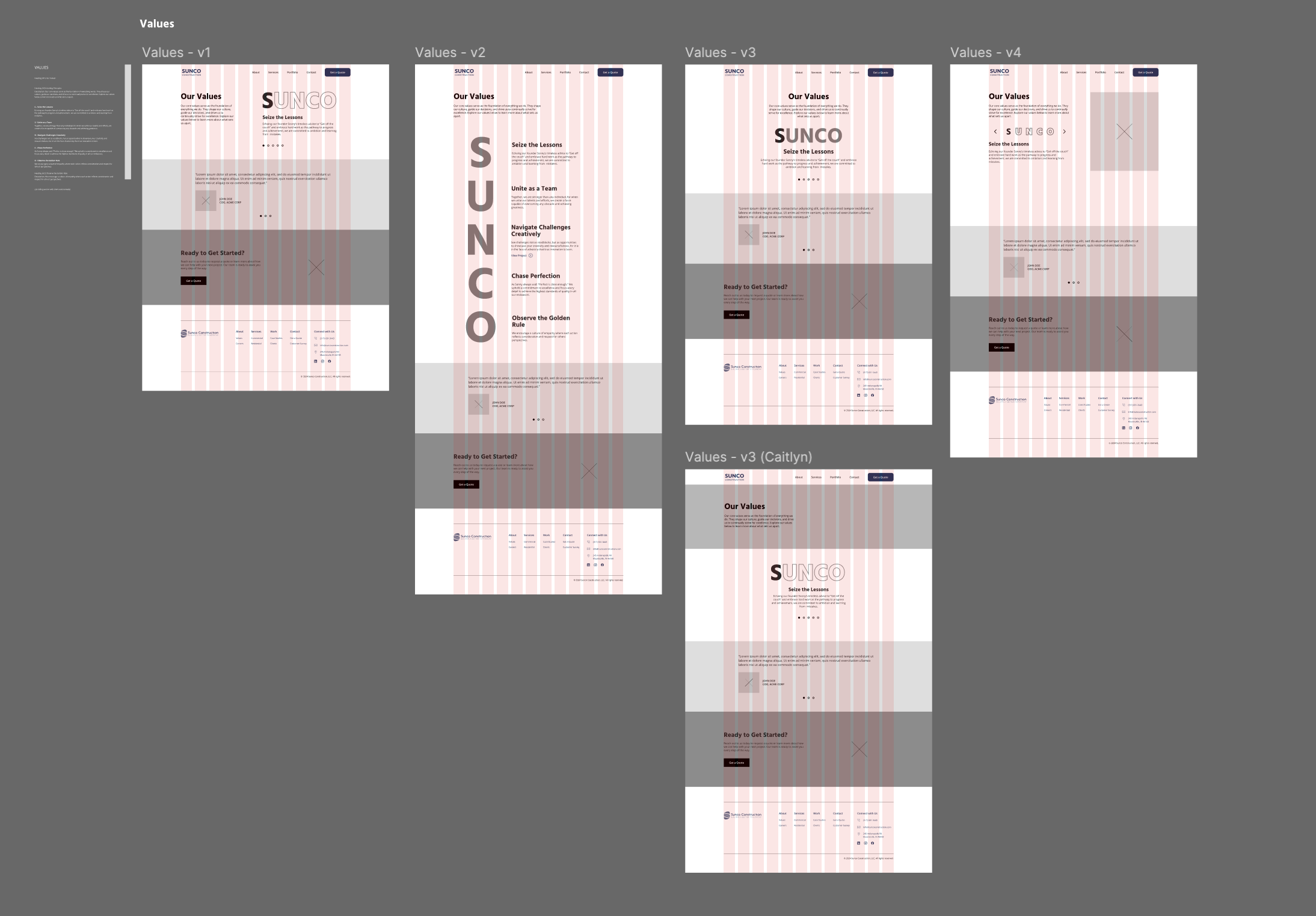
With the architecture approved, I created low-fidelity wireframes to outline the functional layout of each page. These wireframes served as a foundational blockout that prioritized usability, content hierarchy, and accessibility. Once completed, I handed the wireframes over to a web designer, who applied Sunco’s branding elements, colors, and visual assets to create a cohesive design that aligned with the company’s aesthetic.
I then created an interactive prototype in Figma, allowing the Sunco team to review the user flow and interact with the proposed design before development. This phase was essential for gathering feedback and making any necessary adjustments to improve the user experience.
Development
To ensure ease of maintenance and content management, we chose Squarespace as the platform for the build. This allowed Sunco’s team to make updates and manage content independently post-launch, ensuring the site would remain current without extensive technical support.
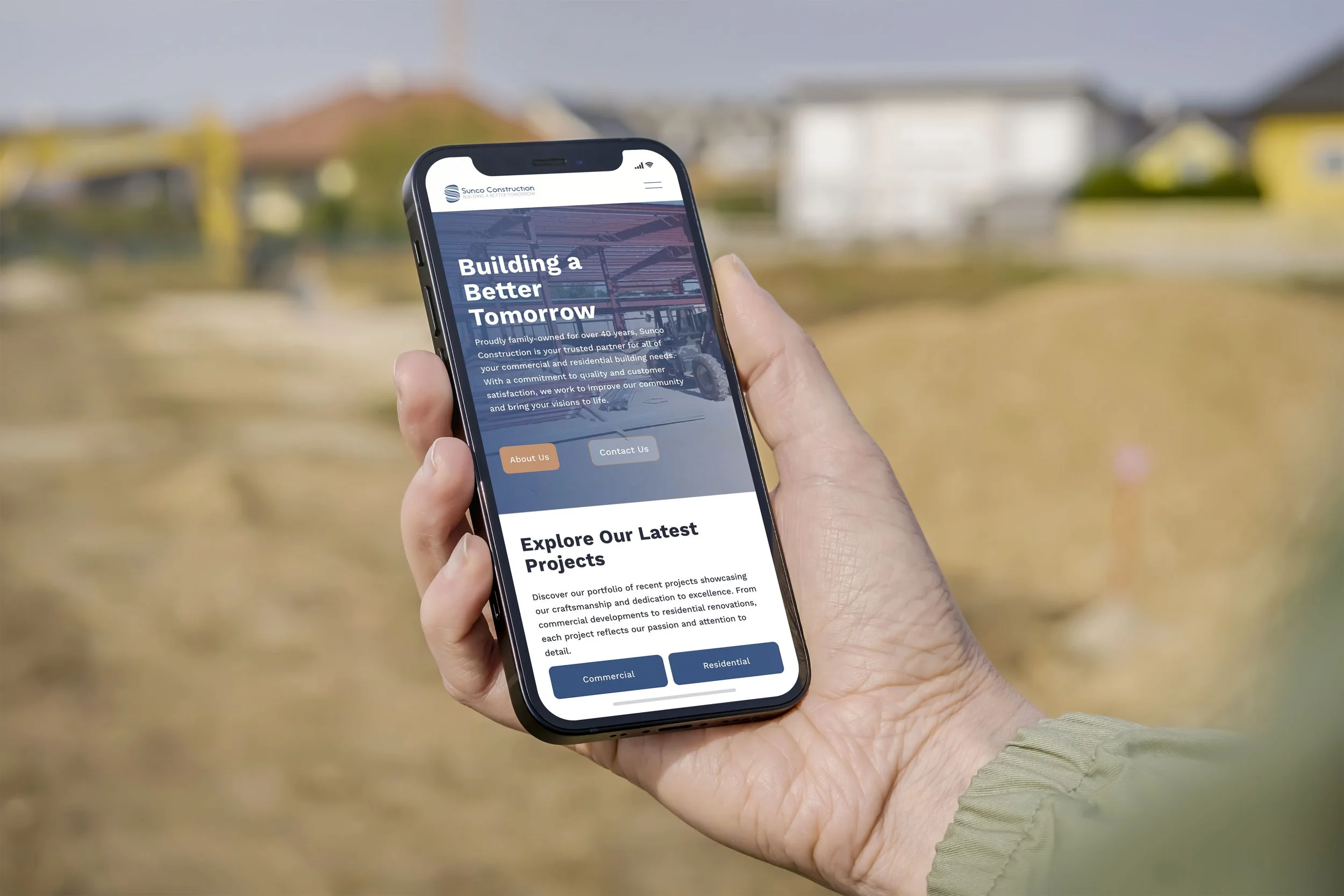
Squarespace’s responsive design capabilities ensured that the website was optimized across devices, providing a seamless experience for both desktop and mobile users. I collaborated closely with the development team to bring the interactive prototype to life, focusing on load time optimization and ensuring that all visual elements rendered effectively across devices.
Launch and Post-Launch Analysis
After launching the redesigned Sunco Construction website, we monitored initial analytics to gauge user engagement and effectiveness of the new site architecture. Despite only minimal SEO work and no public announcement of the launch, the website performed impressively within the first 30 days, showcasing the impact of our user-centered design and architecture choices.
Key Insights at the 30-Day Mark:
414 Website Visits and 375 Unique Visitors: The high number of unique visitors and minimal repeat traffic (39 users) suggest that the website successfully attracted new users, likely due to improved usability and clearer navigation.
252 Direct Visits: A substantial number of users accessed the site directly by typing in the URL (suncoconstruction.com), demonstrating strong brand recognition and intentional searches for the company.
159 Visits from Search Results: The basic SEO work done for the site began to yield organic traffic, with users finding Sunco through search engines.
Top Keywords: Most search visits came from direct searches for “Sunco” or “Sunco Construction,” but there were additional clicks from searches related to “Citizens Bank,” “Mooresville Schools,” “Pioneer Pavilion Community Center,” and “construction company Mooresville,” suggesting that the new SEO strategies expanded Sunco’s reach to related searches in the community.
Device Usage: The majority of users (65%) accessed the site on laptops or desktops, while 35% visited on mobile devices. This insight confirmed that our responsive design choices effectively catered to both desktop and mobile users, ensuring accessibility and a seamless experience across devices.
127 Button Clicks: High engagement was evident in the significant number of button clicks across the site, showing that users were actively exploring content, viewing services, and engaging with the portfolio and contact sections.


